
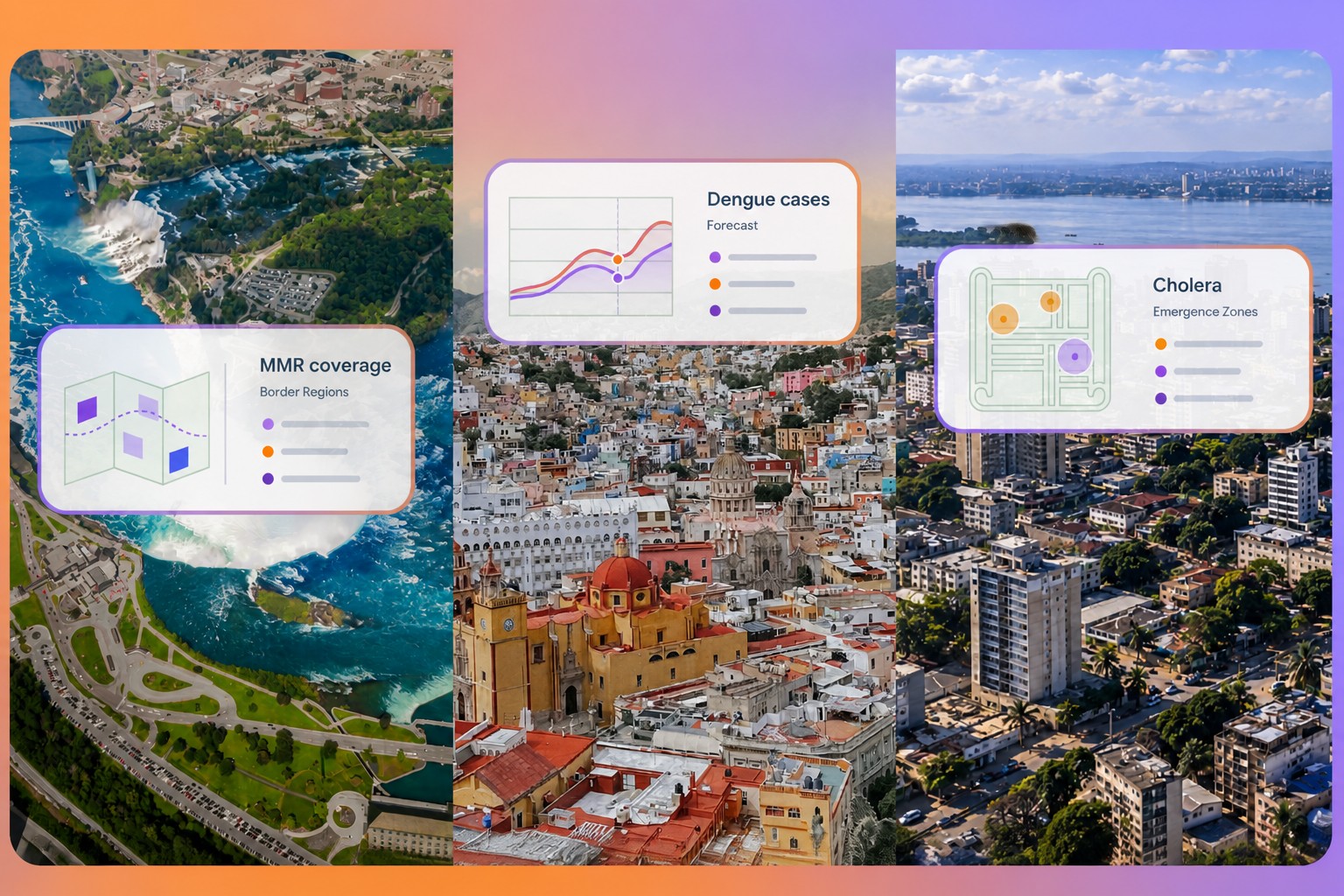
One representation, five tests
Public-health teams often need timely, detailed information to decide where to direct support, prevent disease or prepare for an outbreak. Yet surveillance data can arrive years late, stop at administrative borders or be too sparse to answer local questions. Building a separate data pipeline for each task can also be difficult where resources are limited.
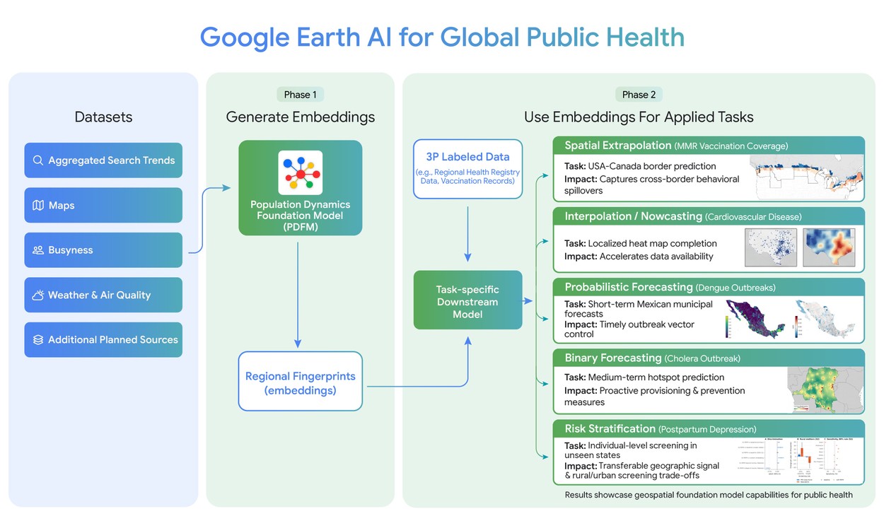
Google Research’s proposal is to use PDFM embeddings as geographic context for existing statistical and machine-learning models. The model brings together several kinds of signals and compresses them into representations of places. Researchers can add those representations to a model without fine-tuning PDFM for each task or building the underlying data pipeline themselves.
The embeddings include:
Google says the representations are designed with privacy protections and updated monthly. Earlier work had used them to fill gaps in a range of US health indicators; this broader evaluation tested them across different diseases, regions and levels of available resources.
Source: research.google
Partners assessed PDFM on five public-health tasks. The results varied: some gains were statistically significant, while others were modest or not statistically significant.
The value is in the gaps
The clearest use case may be where standard data are late or bounded by geography. In the US, official county-level mortality data typically lag by 1–2 years, while American Community Survey figures describe conditions from 2–3 years earlier. In the cardiovascular-mortality evaluation, PDFM embeddings built from one month of data matched census-based models on current-year estimates and covered more places. ACS, by contrast, draws on five years of survey data and is published a year after collection. PDFM was available in 17 countries; ACS covers only the US.
Border effects offer another test of whether a place-based representation captures context that administrative datasets miss. Among 146 US counties within 150 kilometers of the Canadian border, models using only US data often predicted local vaccination coverage poorly. Adding data from Canadian postal zones helped the models account for movement and behavior on both sides. The share of variation in MMR vaccination coverage explained by the models rose from 16% to 22%; estimates changed by at least 3 percentage points for 4.7 million people in border areas.
The dengue results point to a narrower advantage. Google and its academic partners combined PDFM with TimesFM 2.0, an open time-series foundation model, to forecast cases in about 2,450 Mexican municipalities from 2020 to 2025. The strongest gains came at a one-month horizon, in no more than 72% of municipalities with active transmission. Across those areas, error reductions were 3.4 times larger than error increases.
For postpartum depression, community context added information to individual records. In a modeled system that could contact the 20% of mothers at highest risk, adding PDFM would reach 5,640 more rural residents with postpartum depression each year. In a different scenario aimed at identifying 80% of cases, it would reduce false alarms by 17,723 a year.
I think the strongest evidence here is not that one model works everywhere, but that a shared representation can sometimes make existing models more useful when data are stale, incomplete or cut off at borders. The gains are not uniform: the cardiovascular comparison found no statistically significant difference, and dengue improvements were concentrated in active transmission areas. That makes the approach look more like a potentially useful data layer than a general replacement for local surveillance.
When an earlier warning matters
Cholera shows why forecast horizon matters. In the Democratic Republic of the Congo, outbreaks begin in fewer than one of 100 health zones in a given week, making them difficult to predict. For warnings one to two weeks ahead, recent case counts supplied most of the signal and PDFM did not significantly improve accuracy. At four to eight weeks, the added context helped.
At an eight-week horizon, the number of correct picks among the five highest-risk zones rose from 1.78 to 2.10 per week. In 15 endemic zones—where cholera had been reported in at least half of the weeks—the precision of that five-zone list increased from 0.3333 to 0.3975.
The distinction matters operationally: a forecast is useful only if it arrives early enough to change what health teams can do. Here, the proposed value is not more accurate short-term tracking, but a better chance to position vaccines and clean-water supplies weeks ahead.
What the results leave open
Google says PDFM’s current limitation is that its data snapshots are static. Researchers are working on embeddings that change over time and on transferring models to regions with limited connectivity. The cholera work also used a lightweight version adapted for areas with weak internet access.
I’d want to know how these gains hold up when health teams use the embeddings in routine decisions, rather than in retrospective evaluations. The announcement establishes that PDFM can add signal in several settings; it does not show that the added signal will consistently change outcomes or resource allocation. The embeddings are available in commercial early access as Population Dynamics Insights on Google Maps, while academic researchers and public-health professionals can request free access for specific research projects not involving operational use.
That boundary is important. A monthly representation can make delayed data less of a constraint, but it cannot by itself make an outbreak forecast actionable. The next test is whether the context it adds reaches the people and places that need a response in time.
Daily AI news
Every day we pick what actually matters in AI and explain it plainly — no hype, no filler. Subscribe if you want to follow where the industry is going.
Only what matters — every day
Follow on X