
Google has handed the whole geospatial modelling pipeline to a language model. The Planetary Prediction Engine, released as an experimental capability inside Google Earth AI, takes a question in plain language, finds planetary-scale datasets that bear on it, cleans them, builds features, trains and scores models, and writes the report. On 21 CDC health indicators it reached a mean R² of 76.8% against 60.0% for a hand-built expert pipeline — the work that currently occupies a specialist team for weeks.
The bottleneck PPE is aimed at was never the modelling. Geospatial data sits in a fragmented ecosystem, and teams spend weeks selecting and cleaning sources by hand, engineering features and running spatial validation before any model is fitted. Existing AutoML systems and LLM-based agents automate the standard machine-learning steps, but they expect prepared tabular input and lack the specialised capabilities to work on geospatial problems autonomously. Nobody had automated the part where you go and find the data — which is why planetary-scale analysis stays slow exactly when speed matters most, during a humanitarian crisis.
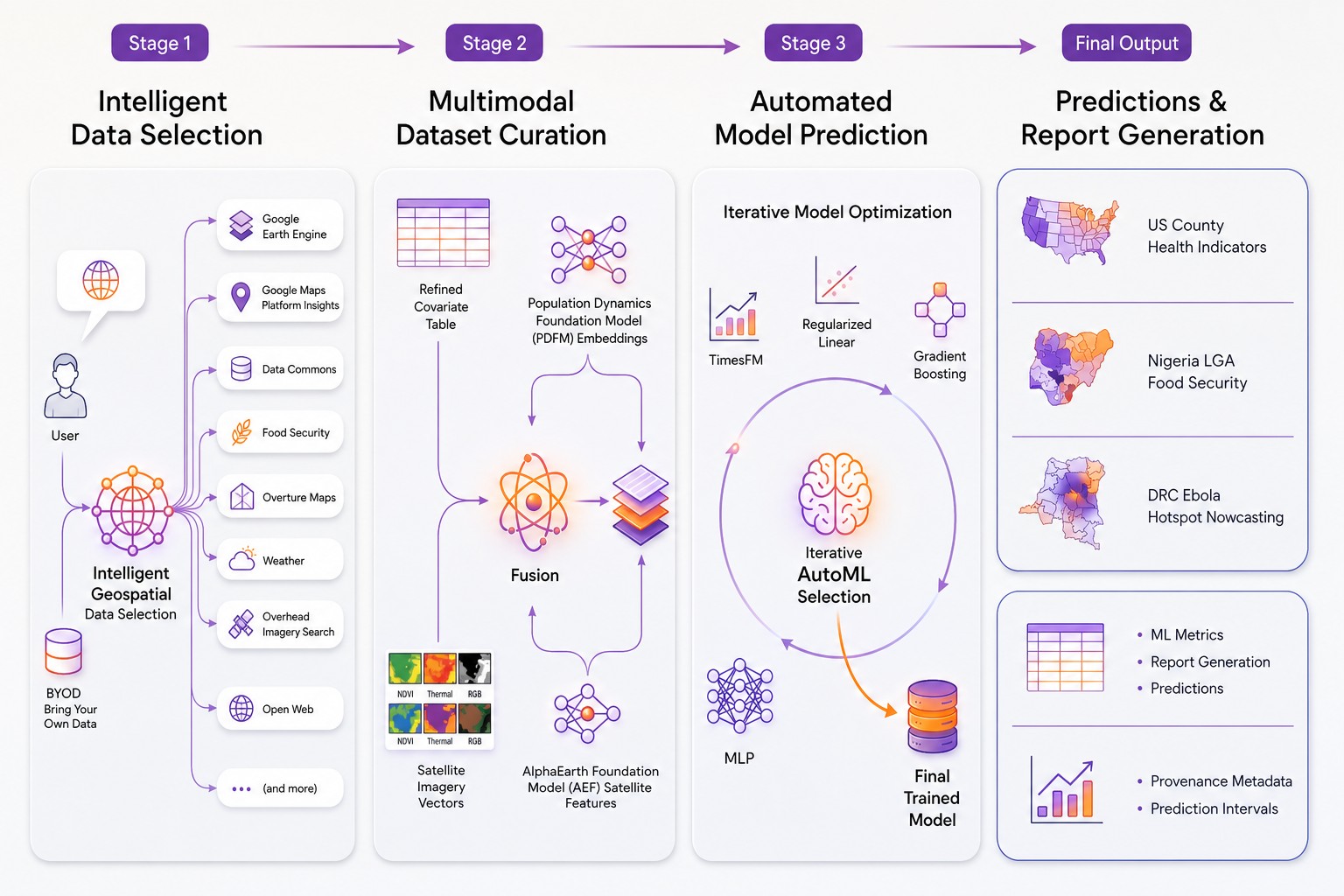
Google had already shown Earth AI combining heterogeneous geospatial sources intelligently. PPE is the step from retrieval to the full loop. It splits the work into three modular stages, each driven by an LLM: intelligent data selection, dataset preparation, then AutoML and prediction. Each stage runs independently against clearly defined inputs and outputs, and off-the-shelf LLMs coordinate the operations inside them.
The load-bearing engineering decision is smaller than any of that and easy to miss: data artefacts move between stages as opaque identifiers rather than being placed into LLM prompts. That is what keeps the system from running into context-window limits, and it is the difference between a demo that handles a county and a system that handles a continent.
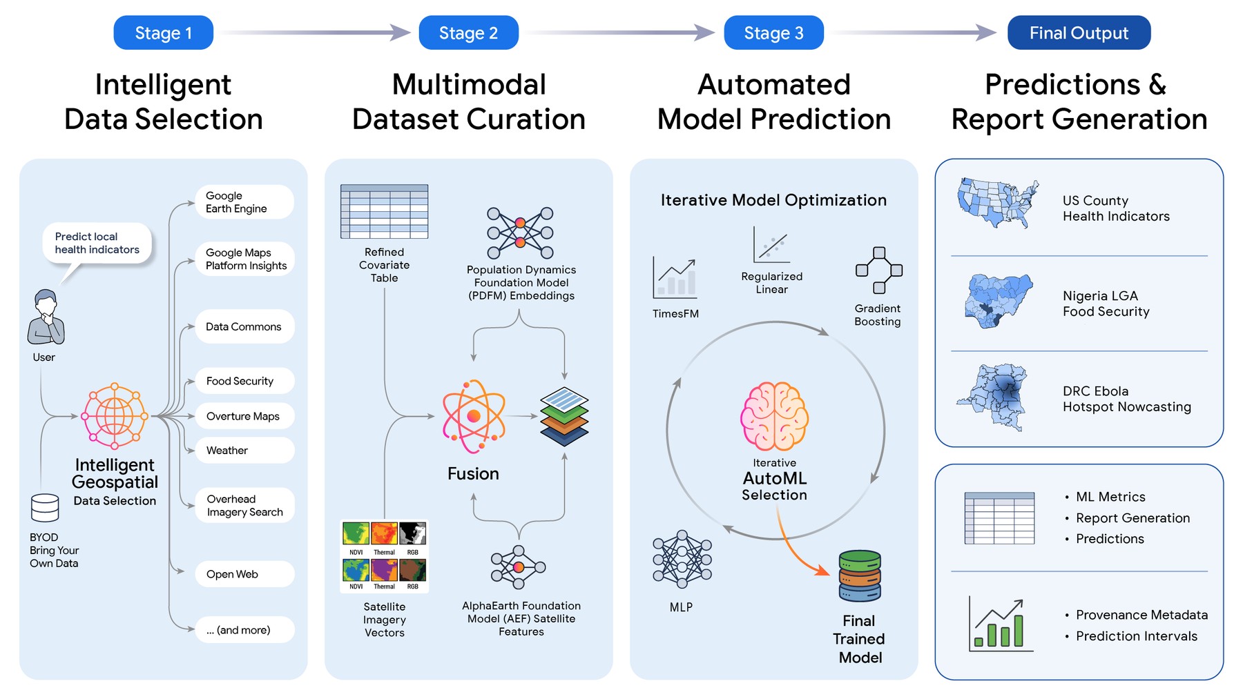
Block diagram detailing the four stages of the Planetary Prediction Engine, from data selection to final report generation
Source: research.google
The evaluation ran across a multidimensional matrix of machine-learning approaches, regions and scientific domains. Beyond the CDC indicators, PPE hit a mean R² of 64.9% on FEMA's national risk indicators against a 60.0% baseline, and 66.2% against 58.6% on the social vulnerability index.
The result that justifies the project is elsewhere. In data-poor regions, figures averaged over large territories routinely hide local vulnerability. PPE assembles local market shocks, food price anomalies and microclimate indicators on its own, and when downscaling food security from the province or state level (ADM1) to the local district level (ADM2) it more than doubled the baseline: R² of 66.1% against 31.5%. The output is a detailed vulnerability map for humanitarian organisations, at the resolution decisions are actually made.
Animation detailing the four stages of the Planetary Prediction Engine, from data selection to final report generation
Source: research.google
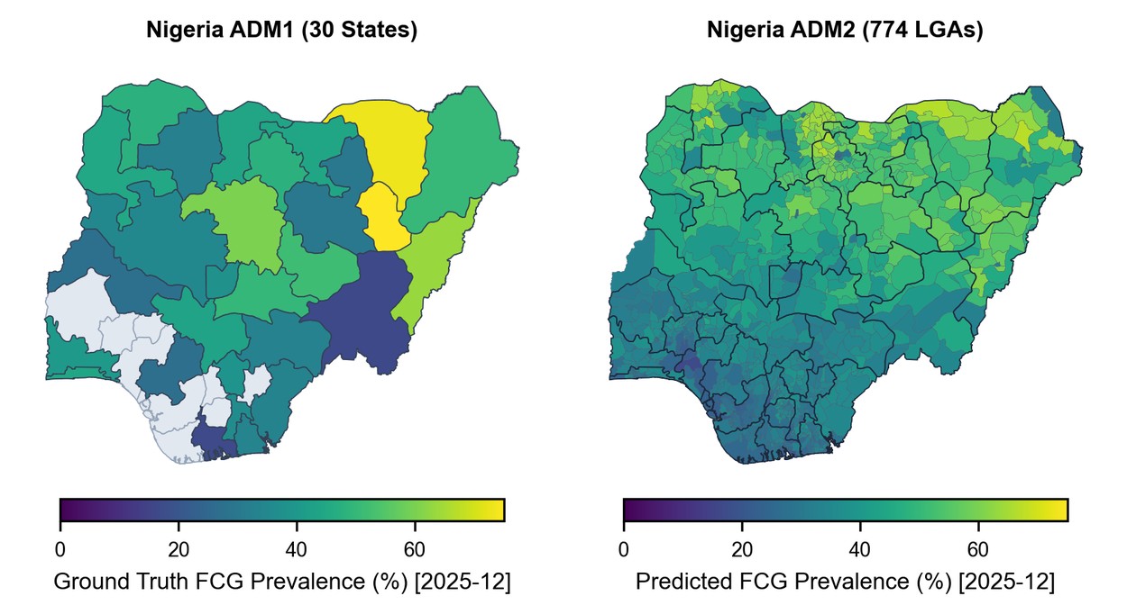
Paired maps of Nigeria comparing actual and predicted food consumption group prevalence for December 2025
Source: research.google
The live test was the 2026 Bundibugyo ebolavirus outbreak in the Democratic Republic of Congo, where PPE forecast new transmission sites at Recall@10 of 83.3% — across five consecutive weekly forecasts it correctly identified 15 of the 18 health zones the virus reached for the first time. That is 10.3 percentage points above the published baseline for state-of-the-art Bayesian models, around 73%. The authors attribute the gain to fusing epidemiological signals, PDFM embeddings and the geospatial features PPE selected itself.
The fusion point held across every experiment. Structured statistical features give explicit, interpretable signals; Population Dynamics embeddings and AlphaEarth Foundations encode complex non-linear patterns learned in pre-training on large datasets. Neither describes a situation fully alone. Ablation studies showed that multimodal fusion combined with intelligent data selection consistently beat the baselines, and that the two representations complement rather than duplicate each other. Google plans to widen the set of geospatial sources and add multimodal Remote Sensing Foundations embeddings.
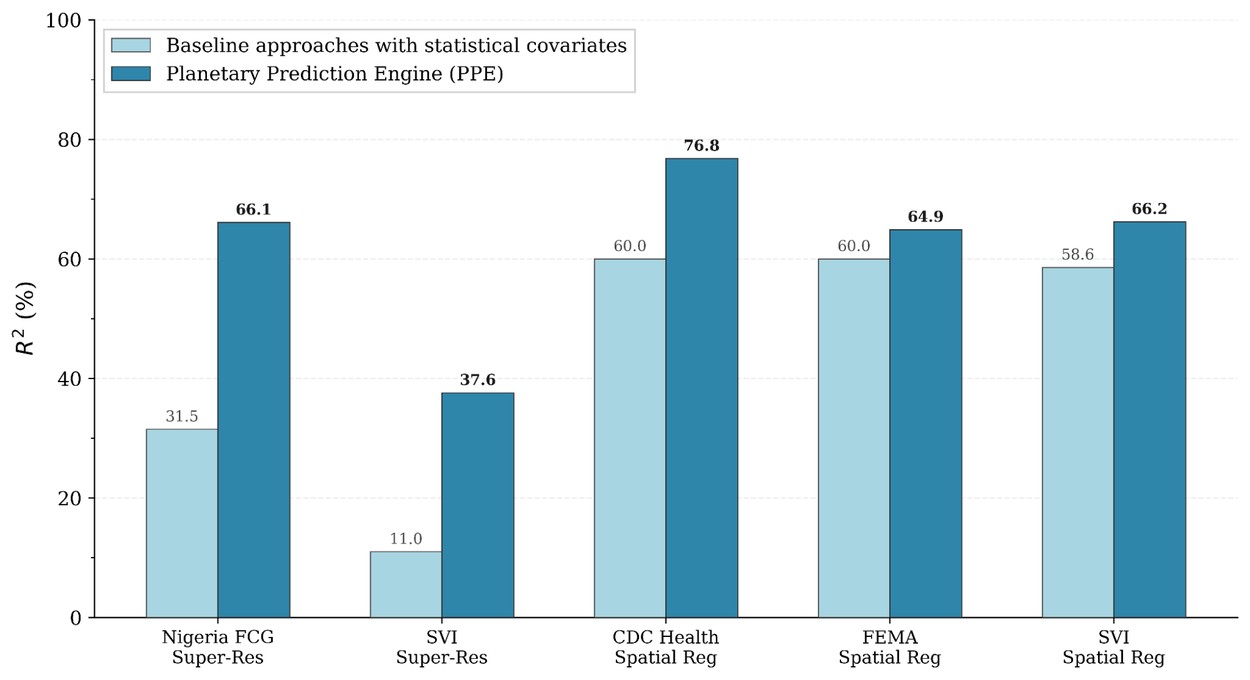
Bar chart showing the Planetary Prediction Engine outperforming baselines across five spatial tasks
Source: research.google
Read the numbers next to each other and the headline gap turns out to be the outlier. The CDC result is 16.8 points over baseline; FEMA is 4.9 and the vulnerability index 7.6. On two of the three US benchmarks PPE is a few points better than the hand-built pipeline, not a different class of thing. I read that as the honest shape of the claim: automation buys you a competent pipeline in hours instead of weeks, and occasionally a better one. The two US baselines also both land on 60.0%, which is either a coincidence or a sign that the comparison pipeline is a single generic construction rather than a domain expert's best effort — the write-up does not say which.
The Ebola figure deserves the same treatment. Recall@10 of 83.3% is 15 of 18: one missed health zone moves the number by more than five points, and the comparison is to a published baseline rather than to a Bayesian model re-run over the same five weeks. That is a promising operational result on a small denominator, and it is being reported during an active outbreak, which is the only condition under which it could be reported at all.
Notably absent from the announcement: who can run this, at what cost, and what happens when the data-selection stage picks the wrong source. An automated pipeline that silently chooses a bad dataset produces a confident map with no expert in the loop to doubt it — and a vulnerability map for a humanitarian agency is not a benchmark row. Google calls PPE an early-stage experimental research project and says it plans to explore new applications, which is the appropriate register; the credits list, though, is already operational. The UN World Food Programme and its Vulnerability Analysis and Mapping team supplied data and support, Google worked with the Institut National de Recherche Biomédicale on the DRC forecasts, and the data and model infrastructure came from the Data Commons, Google Earth Engine, Population Dynamics Foundation Models and AlphaEarth teams.
The pitch is that researchers, humanitarian organisations and government bodies can stop assembling specialist teams and concentrate on framing hypotheses. That is a real saving, and it relocates the expertise rather than removing the need for it: the judgement that used to live in data selection now has to live in reading the output. Whoever writes the next famine map with this will find out whether that trade holds at ADM2.