

One chart has become the shorthand for both sides of the AI bubble argument: weekly token usage on OpenRouter, the marketplace developers use to route requests across competing models, climbing steeply since the start of 2025. Read one way, the curve is demand. Read another, it is inflation — of tokens, not of customers. The slope itself is not in dispute. What the slope measures is, and on that question the picture is close to silent.
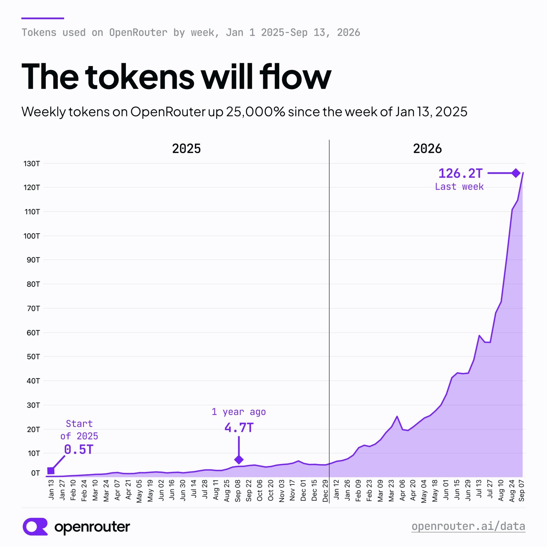
A sharp rise in tokens does not imply a matching rise in actual usage or in business value. Models that reason generate large volumes of thinking tokens before they answer, and that alone pushes the bill up steeply. A modest increase in the number of requests can produce an enormous jump in token consumption — especially in unoptimized agent systems, which consume tokens in very large volumes.
The leaderboard makes the gap visible. GPT 5.6 Luna, from OpenAI, recently took first place in token consumption on OpenRouter. That does not necessarily mean more people are using it; the model may simply generate more tokens per prompt. By revenue, the leader is a different OpenAI model: Astra.
Two models from the same company topping two different rankings is the most useful detail in this picture. Some of that divergence is ordinary price difference — models are not billed at the same rate per token, so revenue and volume were never going to line up perfectly. But price alone does not account for a verbosity effect that the platform's own numbers now display: whoever writes the longest answer wins the volume chart, and winning the volume chart says nothing about how many people asked.
The Chinese models on the platform are the other exhibit. Kimi, GLM and DeepSeek are growing fast — monthly spend on them rose tenfold in 2026. That multiple will carry headlines further than it deserves, because they started from a much smaller base. A tenfold rise off a small number and a flat line off a large one can describe two businesses of similar size.
What the chart does not carry is a denominator. Tokens per request, requests per developer, tokens per finished task — any one of them would separate the two stories, and none of them is on the axis. As published, the curve fits "many more people are building on these models" and "roughly the same people are building roughly the same things at several times the token cost, because the models now think out loud and the agents re-check each other's work" equally well. My read is that both are happening, and this chart cannot apportion them.
That is not an argument that the demand is fake. It is an argument that the industry's favorite evidence of demand is an input metric wearing an output metric's clothes. As long as reasoning and agent loops keep raising the token price of the same work, the line can keep climbing straight through a slowdown in the thing it is supposed to prove — and the people circulating it will still be right about the slope.