
Design you can actually edit
Image generators have learned to make beautiful posters. Coding agents have learned to assemble tidy pages in HTML and CSS. Between those two worlds, though, there has always been an awkward gap.
An image looks striking, but it is a flattened bitmap: the text inside it often breaks, the layers cannot be pulled apart, the headline cannot be dragged with a mouse. Code is easy to edit, but the result often looks like a template: a big heading, a couple of cards, a lot of whitespace, not much taste.
The authors of Editable Visual Design propose folding both approaches into a single pipeline. The idea is simple: let one model first imagine the design, and another then build it as an editable artifact. The output is a layout where the text is live, the elements sit on separate layers, and the result can be opened and edited by hand.
If you want to move from pretty demos to real design automation, that is not enough. In production you have to generate a poster, fix it, adapt it, export it, and not break it along the way.
What today's generators get wrong
Automated design today has two extreme modes.
🟠 Image generation gives you composition, light, texture and overall visual tone, but it almost always hands back the final result as one flat picture.
🟠 Code generation gives you layers, real text and easy editing, but it has a poor feel for composition and style.
The authors put it in almost human terms: some systems have a "right hemisphere", others a "left" one. Some can make things beautiful, others can make them structured. Putting the two together has barely worked so far.
The problem is most visible in tasks that call for production design rather than just a striking picture. For example:
🟣 Text-heavy posters, where a mangled letter is unacceptable.
🟣 Infographics, where the elements have to move independently of one another.
🟣 Marketing materials, which later get reworked for a different size, language or brand.
If you have ever tried to fix the text inside a generated image, you already know the first half of the problem. If you have ever asked an LLM to lay out a good-looking promo poster, you know the second half: everything is formally correct and it still looks cheap.
What the authors propose
The authors call their approach editable visual design. In practice it is a multi-step pipeline in which different models play different roles.
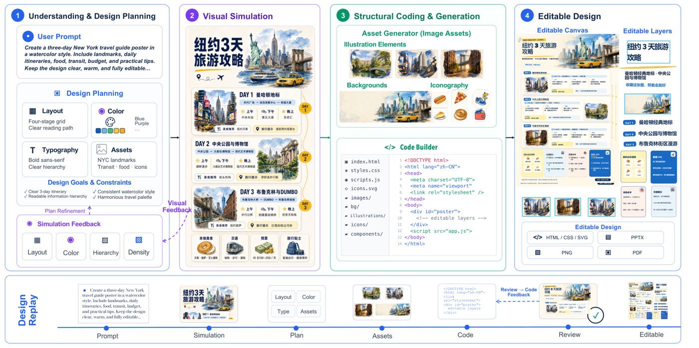
The overall pipeline: one model plans and imagines the design, another generates the visual assets, and then an agent assembles an editable layout in HTML/CSS/SVG.
At the center of it sits a coding agent. But it does not start with code. First the system builds an imagined reference of the layout to come — not a rough wireframe, but something close to a visual premonition of the finished work. The authors call this an "imagine first, then build" logic.
From there the work is divided up:
🟠 A multimodal model reads the brief, decides what goes where, picks the style and judges the result.
🟠 An image generation model produces individual visual assets on demand: a background, an object, an illustration, a decorative element.
🟠 A coding agent assembles all of it in native HTML/CSS, spreads it across layers and adds real text.
The key point is that the final layout is not cut out of the generated picture. The picture is there as a visual anchor. The final artifact is built from scratch: text separately, background separately, illustrations separately.
That gives the approach something image generators normally lack: editability at the layer level.
How the pipeline works
The pipeline has five steps.
1. Reading the brief and planning
The system reads the assignment: what format is needed, what size, what style, what content is mandatory. Then it calls the image model to get an imagined version of the design to come.
This is not the final result. It is closer to a visual reference point for the agent itself. It helps settle composition, palette, rhythm and general mood before any layout work starts.
2. Visual simulation
Next the agent analyzes that reference as a source of visual cues. It does not copy the picture pixel for pixel. It pulls useful things out of it:
🟣 The color scheme
🟣 How the accents are distributed across the canvas
🟣 The overall style and the density of the composition
Put simply, the agent first looks at what the design could be, and only then decides how to translate that into code.
3. Building the structure and the assets
Then the layout goes into production. The agent decides where the headline goes, where the text blocks go, where the background and the graphics go. If a complex visual element is needed, it does not try to draw it in code. It orders that element separately from the image model.
HTML and CSS are excellent for typography, grids and positioning. They are bad at complex illustration or texture. The authors do not try to force code to do everything. They split the job by role.
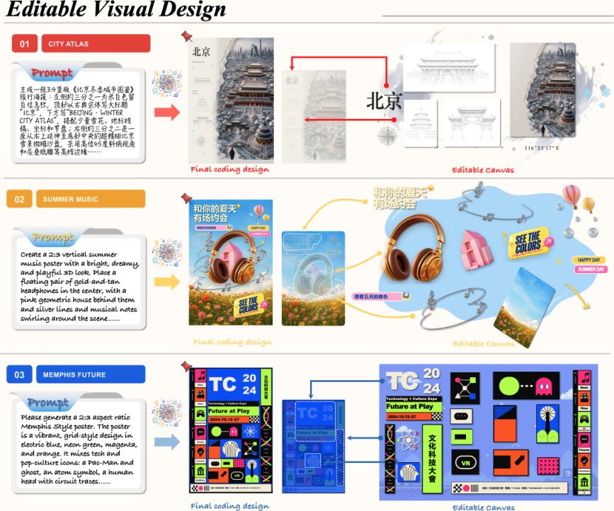
An example of a prompt yielding not a flat picture but an editable canvas with layers: the headline, the illustrations, the badges and the background all stay separate elements.
The result is a fixed-size page where every meaningful element is marked up as its own layer. Coordinates do not depend on window size. It is a designer's canvas written in code.
4. Checking and fixing itself
On the first pass even a good agent gets things wrong. Elements can collide, text can spill past its bounds, an image can cover an important block.
So the pipeline includes a double check:
🟠 A formal check looks at DOM errors, resource loading and overflowing blocks.
🟠 A visual check takes a screenshot of the rendered page and asks a multimodal model whether readability, alignment and balance are all right.
If a problem turns up, the agent makes a local edit to the code and renders the result again.
It looks a lot like how a human designer works: put it together, step back, look at it, spot what is off, fix it.
5. Delivering the result and the process history
The final result is an editable layout made of native DOM elements. Text can be edited, assets can be moved and scaled, layers can be exported separately.
But the authors add one more thing: Design Replay, a full record of how the layout was made.
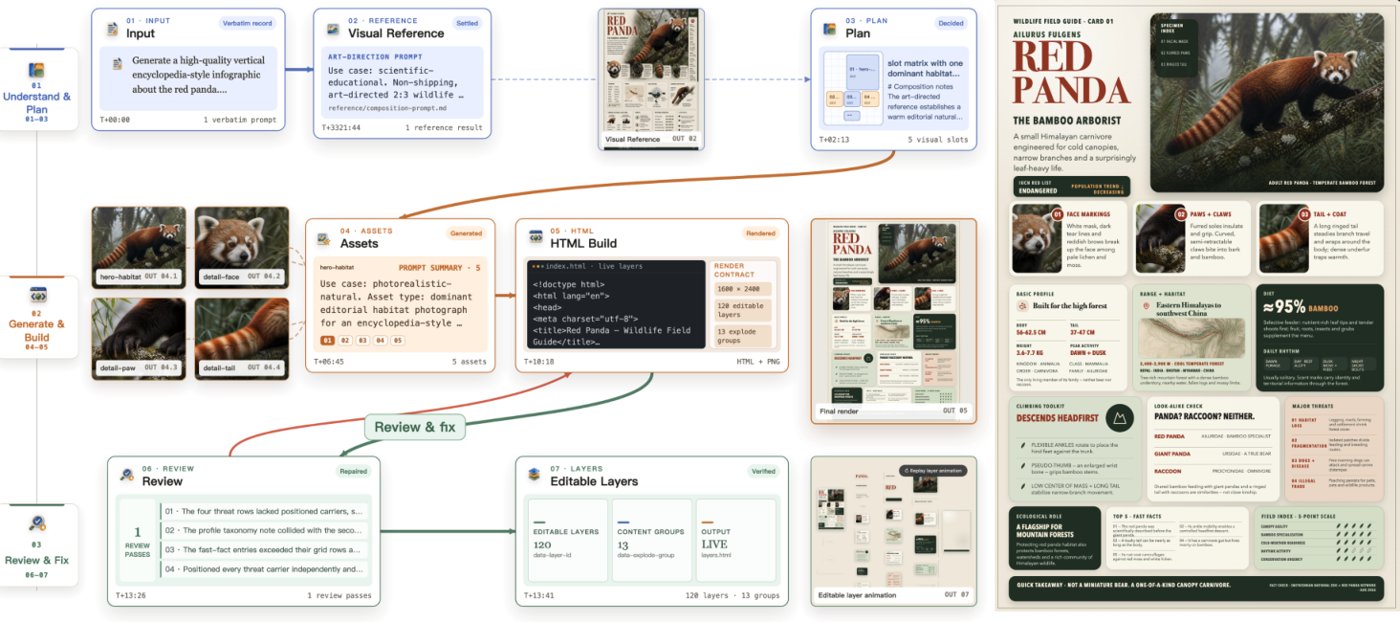
The agent's work step by step: understanding the task, generating and assembling, then checking and fixing; dense layouts involve noticeably more layers and more edits.
The record shows:
🟣 how the agent read the brief
🟣 which visual reference it picked
🟣 which assets it requested
🟣 how the code changed
🟣 what exactly was fixed in the last stage
For a user that is convenient, because you can see exactly where something went wrong. For researchers it is useful too: what you get is not only an artifact but a trajectory of decisions that new systems can be fine-tuned on.
What the results show
The paper has no standard table of metrics and benchmarks. The authors say so plainly: in design, beauty is hard to measure with a single number. So they show cases and comparisons instead.
The clearest comparison is against the two baseline modes: pure image generation and pure code generation.
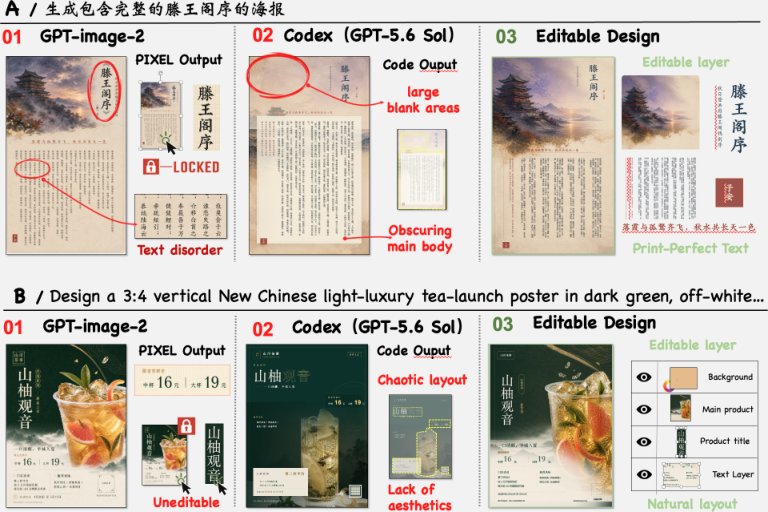
Three approaches on one brief: the image generator gives a beautiful but locked bitmap; the coding agent gives editability but weak composition; the new pipeline combines both properties.
What the comparison shows:
🟠 The image generator makes a visually rich layout, but the text is garbled in places and all the content is fused into a single layer.
🟠 The coding agent on its own produces code and a formally editable page, but the composition is loose and the space is poorly filled.
🟠 Editable Visual Design keeps the typography clean, separates the layers, and still looks closer to designed work than to template layout.
The authors also walk through several scenarios: posters, infographics, long text layouts. In dense cases the system assembles dozens and even hundreds of editable layers. Simpler posters have fewer layers, but the principle is the same: background, text and graphics are not glued together.
The results in short:
🟣 Text stays real text, not part of a picture.
🟣 Layers stay separate from one another, so they can be moved and edited.
🟣 The visual style does not come from template layout, but from the visual simulation done up front.
🟣 Mistakes get fixed iteratively, rather than hidden behind one good-looking render.
Why it matters
On the face of it this is a paper about automated design. What it actually touches is a broader question: how AI systems can combine imagination with structure.
Usually models either generate the final result outright or write the code outright. Here one more step is inserted between intent and action: first get a visual cue, then use it as the anchor for assembly.
That is progress for other tasks too. The approach suggests that generation can be useful not only as a final output but as an internal reasoning tool. Not for mathematics, but for domains where taste, composition, atmosphere and spatial judgement are involved.
There is a product lesson as well. If you build AI tools for creative work, what the user often needs is not a perfect final output but an editable starting point they can keep working on. It is most obvious in design, but the principle could carry over to slide decks, interfaces, landing pages and infographics.
Limitations
The authors promise no magic and are fairly honest about where the system hits its ceiling.
🟠 Quality depends on the underlying models. If the image model gives a dull visual reference, the agent has nothing to build on.
🟠 Complex assets are still a fragile spot. They have to be generated separately and cleanly cut away from the background.
🟠 Long multi-page projects have not been worked out yet. The paper mostly shows single-page layouts.
🟠 Judging beauty stays subjective. There is no simple metric here that says one poster is objectively better than another.
A useful reminder: the scaffolding around a model can improve the result a great deal, but it does not cancel the limits of the models themselves.
The takeaway
Editable Visual Design offers a practical answer to an old problem in generative design: beauty and editability do not have to be separate things.
The authors build a pipeline where the image model supplies the visual intuition and the coding agent supplies the structure, the layers and the live text. What comes out is a layout that looks like design and behaves like a working file.
Several conclusions follow.
🟣 Image generation is useful as an intermediate stage, not only as a final result.
🟣 Code remains the best medium for editable design if you want to change text, move elements and export layers.
🟣 The record of the agent's steps becomes part of the product: it helps the user, and it helps the future fine-tuning of these systems.
🟣 The next step for generative design is a structured artifact you can take straight into production.
If you have been waiting for AI to stop making demos and start making useful design starting points, this is the direction the progress is going.
AI papers in plain words
Every day we read the new AI papers and retell what matters in plain language — no hype, no filler. If you want to see where AI agents are heading before everyone else, subscribe.
New breakdowns every day
On Telegram