
When Data Becomes Video
Turning a spreadsheet into a video means solving several problems at once: finding interesting patterns, choosing charts, writing a script, and timing animations so they appear at the right moment. A modern language model can try to do all of that in one go. In practice, though, this approach often breaks down: charts fail to render, the narration jumps between topics, or a highlight appears before the narrator gets to the relevant metric.
The authors of DataMagic propose breaking the work into clear steps. Their system creates videos from source tables, linking charts, narration, and animation through a shared specification. A team of AI agents then prepares individual scenes, and the system selects and arranges them in a suitable order.
Across 109 examples, DataMagic scored an average of 3.89 out of 5. By comparison, models that generated the entire video in one go scored between 1.91 and 2.22. In a small user study, using the system cut the average time to create a video from 39.2 minutes to 8.
Why One Prompt Isn’t Enough
A data video is a short story told through charts, voice, and motion. It starts by giving viewers the big picture, then reveals specific patterns and highlights an important number or category at just the right moment. A good video must therefore represent the data accurately while bringing its scenes together into a coherent story.
Most existing tools handle only part of the job. Some make charts but don’t write scripts or create animations. Others can narrate finished charts, but require the data and visualizations to be prepared in advance. Video generators can create a complete video, but they may invent numbers or present them in ways that make it hard for viewers to check where they came from.
DataMagic is designed for tables and prompts such as “analyze sales trends” or “compare crop yields by irrigation method.” It needs to work out which aspects to analyze, prepare the data for each chart, formulate the takeaways, and assemble the scenes into a coherent narrative.
To do this, the authors split the task into two levels: what to show in each scene and how the scenes should work together. This makes it easier to avoid planning the whole video all at once—or settling for a random collection of charts.
A Shared Plan for Charts, Narration, and Animation
At the heart of DataMagic is DVSpec, a shared specification for the video that treats each scene as a separate, editable unit. Each scene contains a chart and its data, the narration text, and animation effects. The specification is used both by the AI agents that create the video and by users who want to edit it.
One key technique is to tie highlights to data values rather than to the technical names of on-screen elements. For instance, an animation might refer to the record for January 30. If the rows are reordered or the developers replace a line chart with a bar chart, the system can still find the right point by its date value.
Another technique keeps the voice and visuals in sync. Instead of specifying an exact time—such as “show the highlight at 14 seconds”—the specification points to a line of narration. The corresponding animation appears when that part of the narration begins. If a user edits the script and the voice-over becomes longer or shorter, the system recalculates the timing when it renders the video.
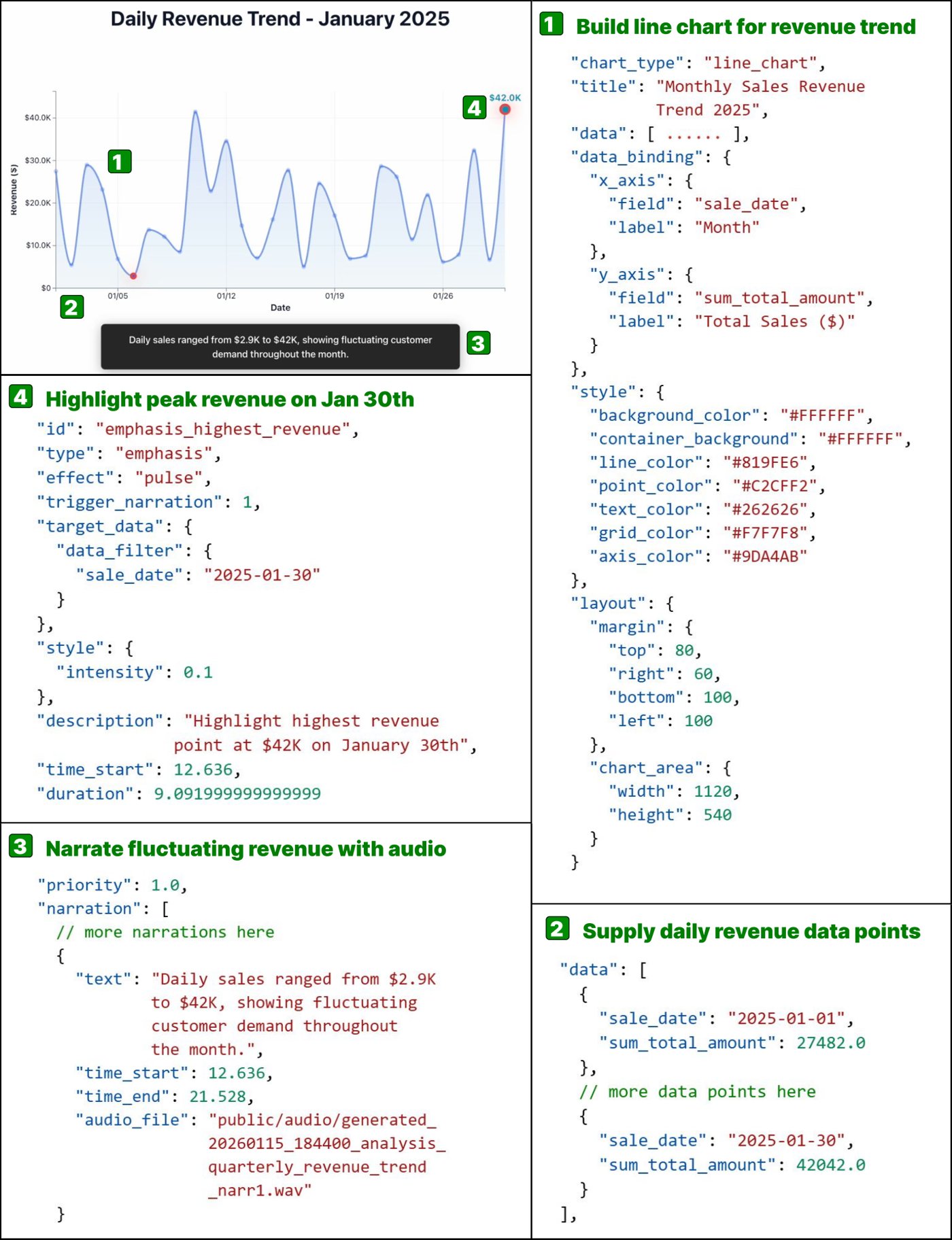
DVSpec connects a chart, its data, narration text, and animation in a single scene specification.
This approach is useful beyond video generation. If a user edits the text or changes the chart, there’s no need to retime the whole video by hand. The system updates the relevant scene while leaving the rest untouched.
DataMagic offers three ways to interact with a video: users can edit the chart directly on the canvas, modify the scene specification, or give instructions in plain language. They can also ask questions about the data and turn an answer into a new scene. The system checks the source table rather than trying to guess values from a chart image.
Generate Options First, Then Build a Coherent Story
DataMagic’s workflow has two main stages. First, the system prepares several possible scenes. Then it selects the most suitable ones and arranges them into a complete narrative.
At the first stage, a planner breaks the prompt into separate lines of analysis. A request to study sales, for example, might be split into revenue trends, regional comparisons, and product contributions to profit. Individual AI agents then prepare the data and choose an appropriate chart type for each question.
The system next selects scenes that address the prompt as a whole and reveal interesting patterns. It decides their order and writes a connected script. If the first scene covers overall revenue trends, the next might compare regions without repeating the introduction. Finally, another agent links the categories and values mentioned in the narration to the corresponding elements in the chart.
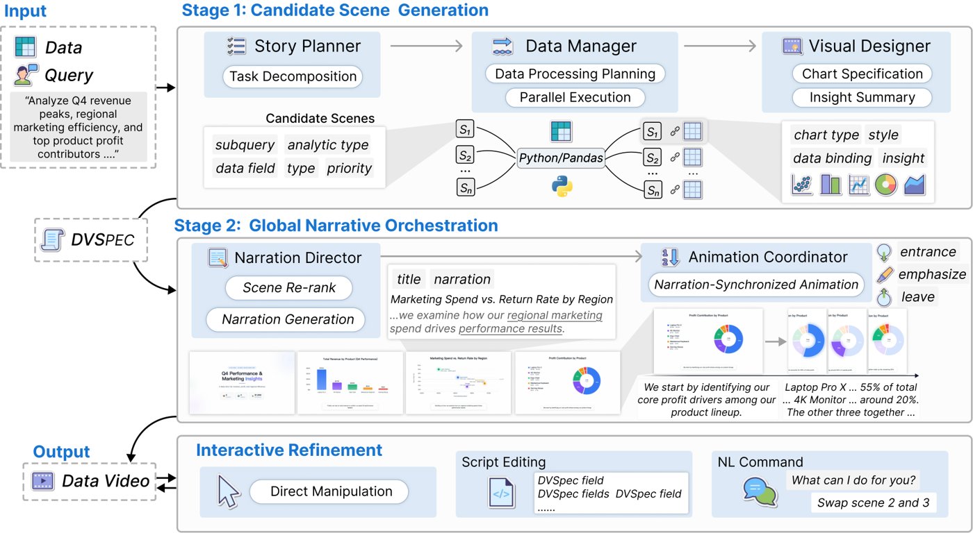
DataMagic workflow: agents prepare scenes, then the system selects and orders them, connects them with a script, and syncs them with the animations.
The authors tested four language models on 109 examples drawn from business and public data. They rated the videos on five dimensions: relevance to the prompt, usefulness of the findings, narrative coherence, animation accuracy, and visual quality. They compared the automated ratings with expert evaluations of a sample of 60 videos. The ratings closely matched, with an overall correlation of 0.91.
What the Tests Found
Models asked to write the code for an entire video in one go didn’t always finish successfully: completion rates ranged from 48.62% to 86.24%. Their average quality scores ranged from 1.91 to 2.22 out of 5.
The same models performed much better as part of DataMagic. More than 95% of runs completed successfully, and average scores ranged from 3.38 to 3.89. The version powered by Claude Sonnet 4 scored highest, at 3.89. Animation and storytelling improved especially noticeably: with direct generation, models often failed to highlight the right value at the right time or connect scenes convincingly.
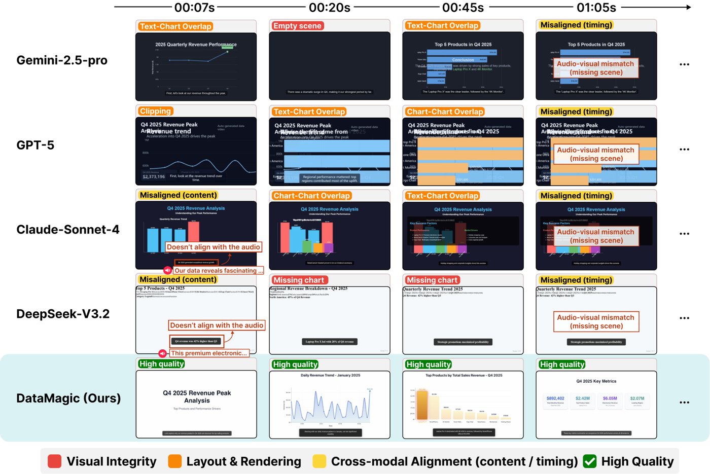
Across all five evaluation dimensions, DataMagic outperforms direct video generation.
There’s a trade-off. Direct generation took about 57 seconds on average, while DataMagic took about 176 seconds, including the time to prepare the specification and create the video. The system takes longer, but it completes more runs successfully and produces a more coherent result.
In a separate test, the authors turned off key parts of the system. Without the planner, the average score fell from 3.89 to 3.44. Without the scene-selection and ordering stage, it dropped to 3.54. This suggests that DataMagic benefits both from having a varied pool of candidate scenes and from checking how those scenes fit together into a story.
The user study was smaller, with 12 participants. Each person created a video in two ways: with DataMagic and in a regular conversation with a language model. The task took an average of 8 minutes with DataMagic, compared with 39.2 minutes in the regular chat. Participants also reported a lower mental workload when using DataMagic. However, they didn’t rate the final results noticeably differently.
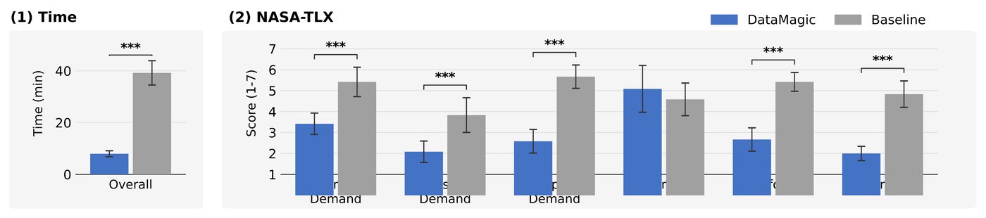
Participants created videos in an average of 8 minutes with DataMagic, compared with 39.2 minutes in a regular conversation with a language model.
What’s Still Difficult
DataMagic has some limitations. For now, it works with individual tables rather than collections of linked tables. The available chart types depend on what the video-generation program supports. And automated ratings can’t replace checking each video: the authors point to examples where a chart is cropped or a spoken value differs slightly from the label on screen.
Animation also involves a trade-off. Structured rules help keep motion in sync with narration and prevent it from distracting viewers, but they can limit the variety of effects. The system favors reliable, easy-to-understand techniques over a completely free-form visual style.
Conclusion
DataMagic shows how a language model can be part of a more controlled video-creation workflow. Instead of relying on one large prompt, the system uses a shared scene specification, divides the work among AI agents, and checks how the scenes fit together into a story. Links to the source data help it find the right chart elements, while tying animations to lines of narration removes the need to set their timing by hand.
The test results show that data videos need their charts and scripts to work together. DataMagic is still slower than direct generation and supports a limited range of data and charts. But when the goal is to create a verifiable video from a spreadsheet, a controlled sequence of steps works better than asking a model to make the whole thing at once.
Read next
 GraphForge: How can you check whether an AI agent has completed
 Raven: Can the necessary AI agents be assembled automatically
 Agensh: How a Thousand AI Agents Work Together Without a Boss
 AgentKernel: How to Give an AI Agent More Freedom with Less Risk
 How an AI agent selects past experience for a new task
 JEV-as-a-Judge: The AI judge maintains 99% accuracy at a lower cost.
 RRSI: How AI agent self-improvement enhances results and saves tokens
 EvoOntology: Why is it difficult for AI agents to work with different
 How AI Agents Can Save Context and Avoid Failures
 How AI Simulates a User’s Thoughts
 Coding agents skip looking at the app when the task gets long
 AI covers six roles in game development, but skills rarely transfer
AI reviews in simple way
Every day we read fresh AI papers and retell the essentials in plain human language — no hype, no fluff. If you want to see where AI agents are heading before everyone else, subscribe.
New reviews — every day
Follow on X